The LONG TEST module was created with a focus on accurate long-term measurements where traditional watch
timers often do not work well (or at all).
It is essentially a graphical data logger, which helps you observe the long-term
behavior of a watch. Various chart indicators are available, such as average rate, moving rate history, rate
drift over time, and more. Long-term measurements for up to 12 hours can be conducted for in-depth analysis of
the watch being tested.
Before conducting a long test, always use the INSTANT module to ensure that a strong and clean signal is being picked up.
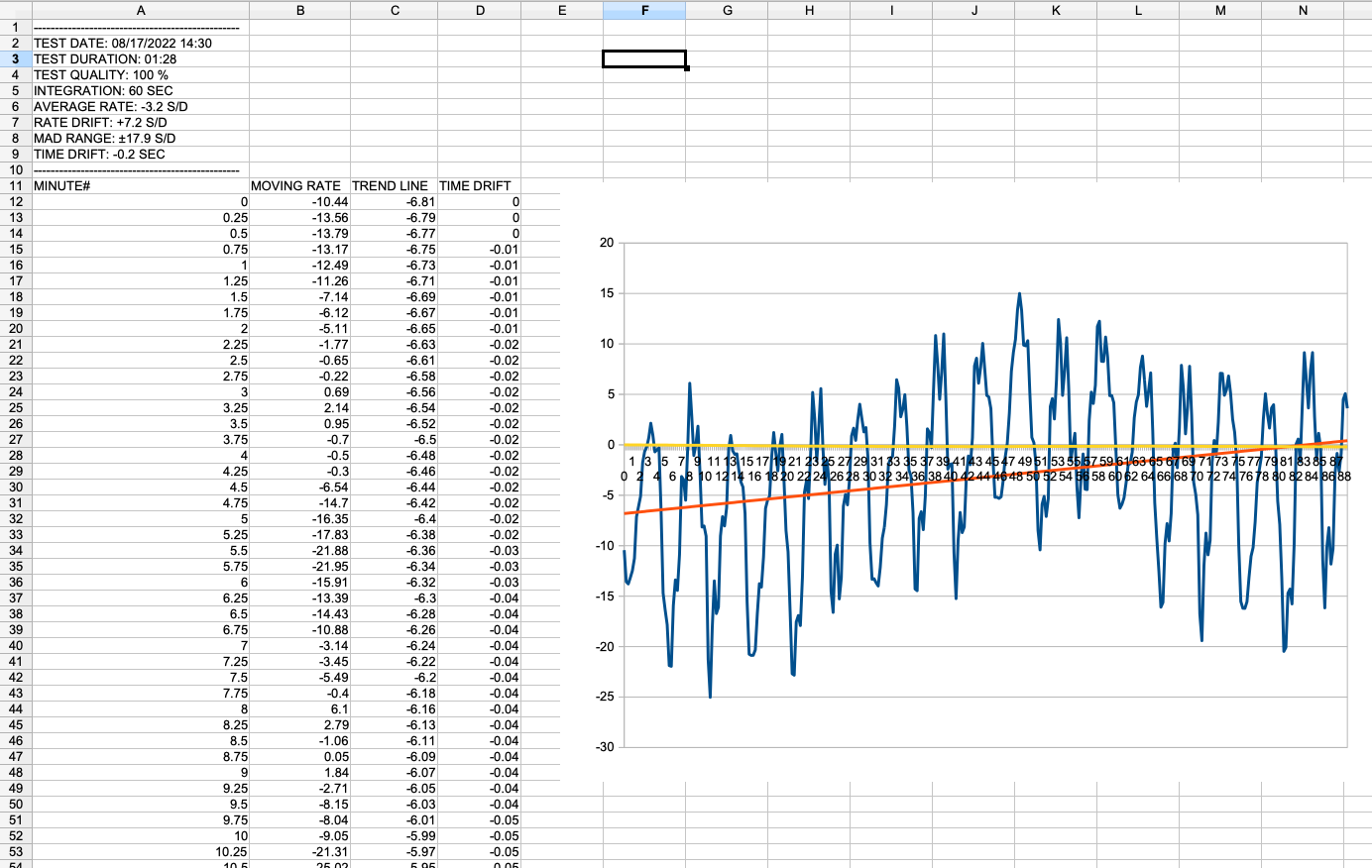
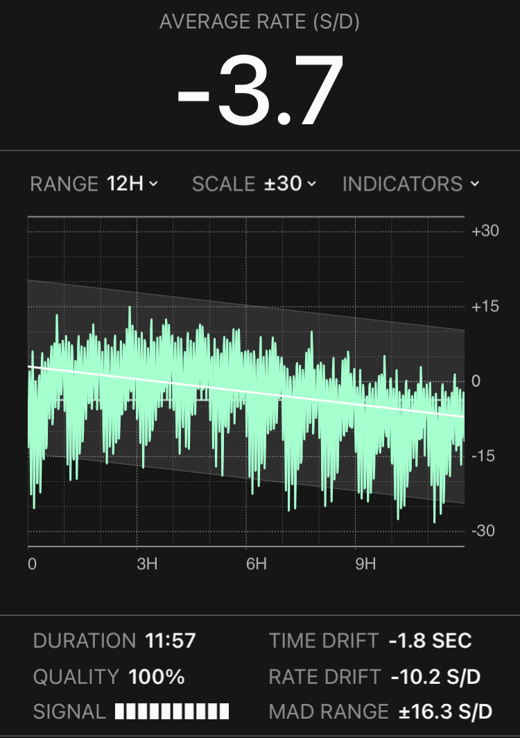
The Average Rate is the arithmetic mean of all the samples collected during the duration of the entire test. It is always shown on top. On the chart display it is represented as a gray horizontal line.
The Integrated, or Moving Rate, is the mean of all the samples in the preceding integration period. On the chart display, it is plotted in green. It illustrates rate fluctuations caused by wheel rotation, complications, etc. In the long run, the effect of mainspring uneven power delivery can be observed. [ see: Chart Samples ]
The Trend Line is the line of best fit for all the samples collected, calculated using least squares fitting. Plotted as a solid white line on the chart display, it visually represents the rate drift over time.
The Rate Drift is an indicator of the long-term rate stability. It is derived from the slope of the trend line. For a perfectly stable watch, with little to no rate deviation, the trend line should be horizontal, and the rate drift should be close to zero.
The Median Absolute Deviation, or MAD, is a measure of statistical dispersion resilient to outliers. Typically, most samples fit within a range of ±3 deviations from the trend line. This range can be seen as an indicator of the short-term rate stability.
The Time Drift shows how many seconds the watch has gained or lost for the duration of the entire test. When the chart is switched to time mode, the time drift history is plotted in yellow.
* Trend Line, Rate Drift, and MAD Range have little meaning for short tests. Calculations start after at least 15 minutes of data has been collected. The longer the test duration, the more representative the estimates.
RANGE AND SCALE — The visible time range (horizontal axis) and the error scale (vertical axis) can be
adjusted with the white drop-down labels.
RELATIVE MODE — In this mode, the zero is always aligned to the average line so that all the plots are
relative. The actual error value is ignored for better evaluation of watch rate stability.
INDICATORS MENU — From here each chart indicator can be individually turned on or off.
HISTORY — Tap and drag anywhere on the chart to see the exact values at that point in time.
The test settings screen provides the following configuration options:
INTEGRATION — In this module, up to 10 minutes integration is available.
TIME LIMIT — A timer is set to automatically stop the test after a certain number of
hours.
RATE LIMIT — Stops the test if the moving rate reaches a certain deviation from the average.
RATE DRIFT LIMIT — Stops the test if the rate drift reaches the limit (but not before the first two
hours).
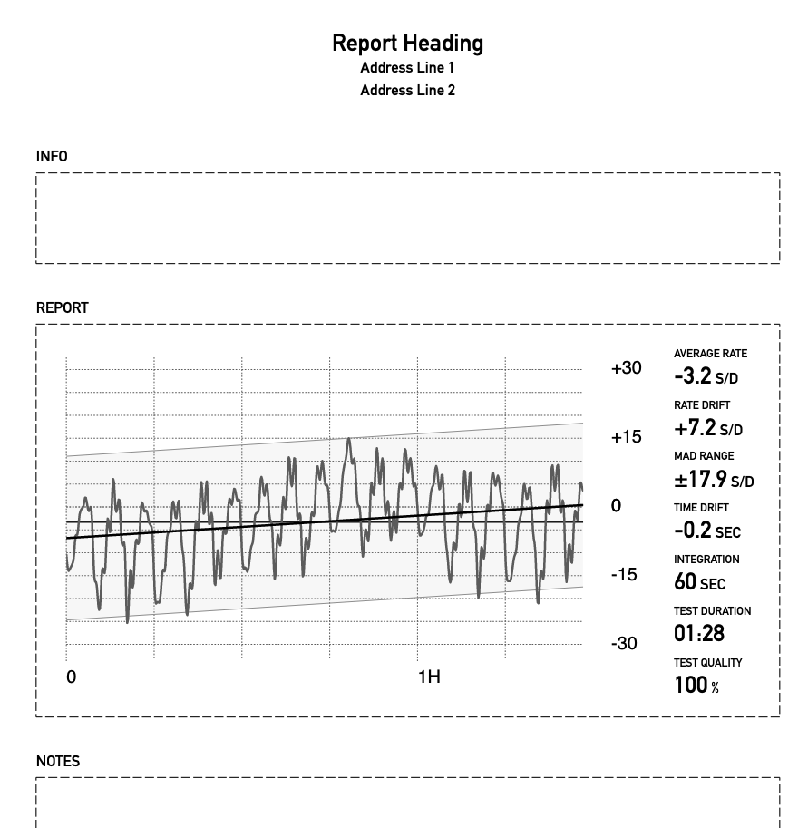
After a test is complete, the Export button is available to save the results to the iOS Files app. You can
choose a file name and enter two lines of info text, such as watch make and model, owner info, etc.
For each export, two separate files are created with .pdf and .csv extensions.
The PDF report resembles the app Chart Display and is designed to be printed, stored with the watch, or sent to
clients. It can be customized with your own business name and contact information (app settings tab).
The .csv file contains the raw data samples and can be imported to your preferred spreadsheet for
detailed analysis.